Monday, May 2, 2011

PSA - Anti Graffiti


Graffiti is a crime and is a problem in many countries, especially in the United States. Graffiti is such a porblme that is is 35 percent of the most common type of property vandalism. Graffiti also known as tagging, was not a very big problem until about 25 years ago to our generation today. It is worse today because of gang, violence, and other territorial reasons. Graffiti is usually done by teenagers or people of the younger generation. It can be a sign of terrioty in gangs, a sign of violence, or just for pure fun. But graffiti can also be seen as artwork and peices of art if done legally with permission. If you see illegal graffiti being done there are places you can call. To help stop graffiti and clean up our neighborhoods in your area contact, 311. if a vandalism crime is in progress, call 911 and report it. after you report it, you must remove the graffiti yourself. Solvents are available at your city;s anti-graffiti unti, or call (877)STOP-TAG.


Thursday, March 17, 2011

Andy Warhol


Andy Warhol

· Real name is Andrew Warhola (8/6/28-2/22/87) (Became Warhol after a misprint)

o Born in Pittsburgh, PA, Parents from Czechoslovakia (does not exist anymore)

o Father worked in a coal mine

· In High School, kicked out of art club because he was “too good”

· Graduated from the Carnegie Institute of Technology (Bachelor of Fine Arts)

· Graduated with degree for pictorial design & wanted to become a commercial illustrator

· Designed advertisements for women’s shoes

· Used Polaroid camera

· Fear of hospitals and doctors, hypochondriac

· Favorite print making technique was silk screening

· Friends & family described him as a workaholic

· His sexuality was speculated upon and how this influenced his relationship to art is “a major subject of scholarship on the artist”

· First solo expedition in 1952

· Coined the term “15 minutes of fame”

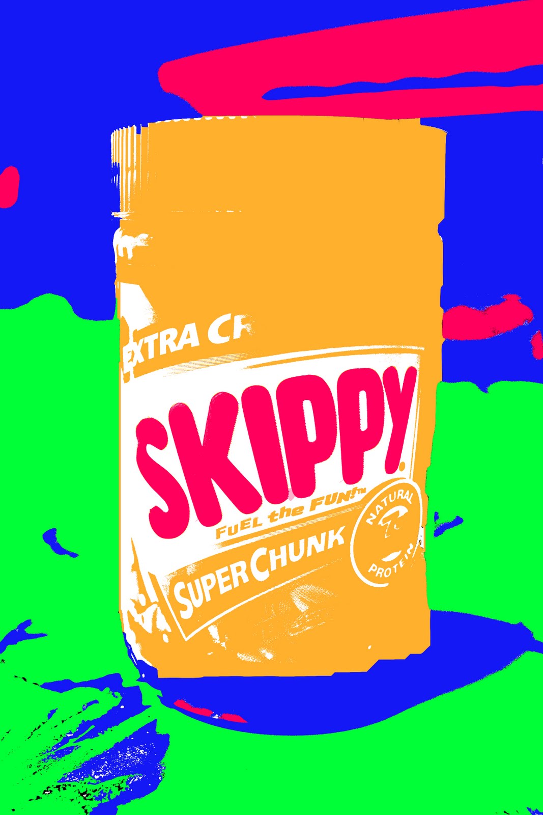
· 1960s: iconic American products (pop art)

· Created The Factory, his NYC studio from 1962-1968

· Celebrity portraits developed into one of the most important aspects of his career

· Made films (first one called Sleep – 6 hours of a man sleeping) (1963)

· 1965 said he was retiring from painting

o 1972 returned to painting

· Designed cover for the Rolling Stones’ album Sticky Fingers (cover made out of real jean material)

· Produced Velvet Underground’s first album

· Started a magazine called Interview, worked for Glamour Magazine, Vogue

· Shot by Valerie Solanas 3 times for being abusive and “too controlling” (6/3/68)

o Solanas authored the S.C.U.M. Manifesto, a separatist feminist document

o "Before I was shot, I always thought that I was more half-there than all-there – I always suspected that I was watching TV instead of living life. People sometimes say that the way things happen in movies is unreal, but actually it's the way things happen in life that's unreal. The movies make emotions look so strong and real, whereas when things really do happen to you, it's like watching television – you don't feel anything. Right when I was being shot and ever since, I knew that I was watching television. The channels switch, but it's all television."

· Marilyn Monroe = favorite model (not painted until after death)

· Wore silver wigs until he dyed his hair silver

· Practicing Ruthenian Rite Catholic who described himself as a religious person

· Died of a heart attack brought on by a gall bladder surgery and water intoxication

· $100,000,000 for one of his paintings (highest amount paid) (“Eight Elvises”)

· Referred to as the “Prince of Pop”

Thursday, March 10, 2011

Photoshop Photo

The point of this project was to show off our skills in Photoshop. Over the past weeks in school, we learned how to use many different techniques to use to manipulate photos. Some techniques we learned how to use are gradient tools, photo filters, de-saturating, color layering, copy and pasting, and blending. So the point of this assignment was to manipulate a photo using the techniques we learned properly.

To achieve my final photograph, I used these techniques. First to start off my process I duplicated the imaged. Then I de-saturated it or made it black and white by creating a new gradient layer and using the gradient map to achieve the value I desired. After, I wanted to isolate the lady bug by putting it in color. I did this by using the eraser, to erase the black and white and make the ladybug its original color. To create the pinkish hue in the left corner of the picture, I then created another layer and using the gradient tool I made a gradient with my desired color. The lady bug in black and white in the bottom right corner is not in my original picture. I found this picture on the internet and blended that image to my main image. To be able to blend it, I changed the sizes of both pictures to the same size then chose apply image. To make my final effect on my picture I chose darken in the layer pull down box. It darkened my photo and kept my blended image black and white. With those effects I was able to create this picture.

I learned a lot from this assignment. I learned how to use the techniques I listed above very well. I feel as if I am more confident in my Photoshop skills now. I think that this photo doesn’t show to much about my photography. I feel like that I would better and my pictures come out better with no manipulation. Photoshop isn’t my strongest area in photography, so I think it decreases the quality of my photos.

Even though I may not be fond of Photoshop, I think by doing this assignment I do think different. I feel like if I don’t take the greatest photo I could change it in Photoshop to make it a good photo. Now my initial thought is that with Photoshop I can turn an ordinary image into something more.

Some elements I used are emphasis, color, value, and rule of thirds. Emphasis and color are shown in the ladybug and so if the rule of thirds. The rest of the image shows value because it is black and white. When a viewers looks at my image I want them to think of a ladybug up close and how pretty it can be. I want them to get 2 different senses of ladybugs especially when they look at the blended photo in the right corner. I think the most powerful point in the image is the red lady bug. And when a viewer’s eye sees it, I want her to think of how cool the lady bug looks.

Friday, February 25, 2011