Monday, May 2, 2011

PSA - Anti Graffiti


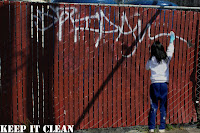
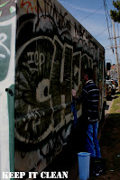
Graffiti is a crime and is a problem in many countries, especially in the United States. Graffiti is such a porblme that is is 35 percent of the most common type of property vandalism. Graffiti also known as tagging, was not a very big problem until about 25 years ago to our generation today. It is worse today because of gang, violence, and other territorial reasons. Graffiti is usually done by teenagers or people of the younger generation. It can be a sign of terrioty in gangs, a sign of violence, or just for pure fun. But graffiti can also be seen as artwork and peices of art if done legally with permission. If you see illegal graffiti being done there are places you can call. To help stop graffiti and clean up our neighborhoods in your area contact, 311. if a vandalism crime is in progress, call 911 and report it. after you report it, you must remove the graffiti yourself. Solvents are available at your city;s anti-graffiti unti, or call (877)STOP-TAG.


Thursday, March 17, 2011

Andy Warhol


Andy Warhol

· Real name is Andrew Warhola (8/6/28-2/22/87) (Became Warhol after a misprint)

o Born in Pittsburgh, PA, Parents from Czechoslovakia (does not exist anymore)

o Father worked in a coal mine

· In High School, kicked out of art club because he was “too good”

· Graduated from the Carnegie Institute of Technology (Bachelor of Fine Arts)

· Graduated with degree for pictorial design & wanted to become a commercial illustrator

· Designed advertisements for women’s shoes

· Used Polaroid camera

· Fear of hospitals and doctors, hypochondriac

· Favorite print making technique was silk screening

· Friends & family described him as a workaholic

· His sexuality was speculated upon and how this influenced his relationship to art is “a major subject of scholarship on the artist”

· First solo expedition in 1952

· Coined the term “15 minutes of fame”

· 1960s: iconic American products (pop art)

· Created The Factory, his NYC studio from 1962-1968

· Celebrity portraits developed into one of the most important aspects of his career

· Made films (first one called Sleep – 6 hours of a man sleeping) (1963)

· 1965 said he was retiring from painting

o 1972 returned to painting

· Designed cover for the Rolling Stones’ album Sticky Fingers (cover made out of real jean material)

· Produced Velvet Underground’s first album

· Started a magazine called Interview, worked for Glamour Magazine, Vogue

· Shot by Valerie Solanas 3 times for being abusive and “too controlling” (6/3/68)

o Solanas authored the S.C.U.M. Manifesto, a separatist feminist document

o "Before I was shot, I always thought that I was more half-there than all-there – I always suspected that I was watching TV instead of living life. People sometimes say that the way things happen in movies is unreal, but actually it's the way things happen in life that's unreal. The movies make emotions look so strong and real, whereas when things really do happen to you, it's like watching television – you don't feel anything. Right when I was being shot and ever since, I knew that I was watching television. The channels switch, but it's all television."

· Marilyn Monroe = favorite model (not painted until after death)

· Wore silver wigs until he dyed his hair silver

· Practicing Ruthenian Rite Catholic who described himself as a religious person

· Died of a heart attack brought on by a gall bladder surgery and water intoxication

· $100,000,000 for one of his paintings (highest amount paid) (“Eight Elvises”)

· Referred to as the “Prince of Pop”
Thursday, March 10, 2011

Photoshop Photo

The point of this project was to show off our skills in Photoshop. Over the past weeks in school, we learned how to use many different techniques to use to manipulate photos. Some techniques we learned how to use are gradient tools, photo filters, de-saturating, color layering, copy and pasting, and blending. So the point of this assignment was to manipulate a photo using the techniques we learned properly.

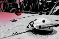
To achieve my final photograph, I used these techniques. First to start off my process I duplicated the imaged. Then I de-saturated it or made it black and white by creating a new gradient layer and using the gradient map to achieve the value I desired. After, I wanted to isolate the lady bug by putting it in color. I did this by using the eraser, to erase the black and white and make the ladybug its original color. To create the pinkish hue in the left corner of the picture, I then created another layer and using the gradient tool I made a gradient with my desired color. The lady bug in black and white in the bottom right corner is not in my original picture. I found this picture on the internet and blended that image to my main image. To be able to blend it, I changed the sizes of both pictures to the same size then chose apply image. To make my final effect on my picture I chose darken in the layer pull down box. It darkened my photo and kept my blended image black and white. With those effects I was able to create this picture.

I learned a lot from this assignment. I learned how to use the techniques I listed above very well. I feel as if I am more confident in my Photoshop skills now. I think that this photo doesn’t show to much about my photography. I feel like that I would better and my pictures come out better with no manipulation. Photoshop isn’t my strongest area in photography, so I think it decreases the quality of my photos.

Even though I may not be fond of Photoshop, I think by doing this assignment I do think different. I feel like if I don’t take the greatest photo I could change it in Photoshop to make it a good photo. Now my initial thought is that with Photoshop I can turn an ordinary image into something more.

Some elements I used are emphasis, color, value, and rule of thirds. Emphasis and color are shown in the ladybug and so if the rule of thirds. The rest of the image shows value because it is black and white. When a viewers looks at my image I want them to think of a ladybug up close and how pretty it can be. I want them to get 2 different senses of ladybugs especially when they look at the blended photo in the right corner. I think the most powerful point in the image is the red lady bug. And when a viewer’s eye sees it, I want her to think of how cool the lady bug looks.

Friday, February 25, 2011

Tuesday, January 25, 2011

Architecture Assignment

This is my interior picture location 3. It is inside the Ferry Building on the Embaradero in San Francisco.

This is my detail picture of location 3. It is the side building of the Ferry Building on the Embarcadero.
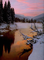
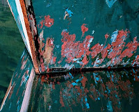
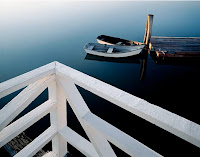
This is my big picture of location 3. It is the Clock Tower and front building of the Ferry Building.


This is my detail picture of location 2. It is a small building on the other side of the Embarcadero away from the water.


This is my big picture location 1. This is a picture of the Noe Hill Building also on the other side of the Embarcadero.


This is another detail shot of location 2. It is another small building on the left side of the Embarcadero.


Thursday, January 20, 2011

Carr Clifton

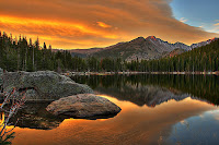
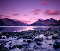
Carr Clifton is a contemporary photographer and also an accomplished wilderness guide and traveler. He is also a large format landscape photographer most famous for his photos of endangered or wild life landscapes. He began shooting in 1977 when he was inspired by his mentor and friend Phillip Hyde. Carr graduated from Colorado Mountain Springs with a degree in commercial photography. And after began free lancing. His pictures are most famous for certain regions like Alaska and Africa. Many of his pictures are showcased in the magazine "Outdoor Photographer". He has won many recent awards, his pictures are showcased in many museums, and even bought all around the world.
-space
-detail
-color
-pattern
-reflection
-variety and unity


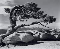
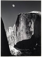
Ansel Adams


Ansel Adams was born on February 20th 1902 and he died on April 22nd 1984. He was born in the great city of San Francisco and is a photographer as well as a environmentalist. He had no formal training in the profession of photography because his family was poor and lacked financial needs. His passion for nature and pictures likely came from the Golden Gate Bridge and other Sf surrounding because he lived close by it. He started off when his parents gave him a Kodak n.1 Brownie Box. He explored Yosemite, went on hikes, nature walks and built his profession and self confidence by himself . Soon after he joined the Sierra Club which he took photos for the daily bulletin. His photos became noticed and soon was discovered by Albert Bender, a patron of the art who immediately jump started his whole career. After Bender helped his career projects were endless for him .
He is best known for his black and white landscape shots, especially in Yosemite National Park. To add to his accomplishments he developed the zone system which determines proper contrast and exposure. With such great photos, he primarily used large format cameras because they ensured sharpness . He confounded the group f/64 and worked with many great masters of photography. But till this day his photos and legacy
still remains especially in his black and white photogra
phs of nature.

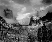
Here is an example of some of his greatest pieces


-rule of thirds
-pattern
-value
-the great landscape shot (distance)
-space


Wednesday, January 19, 2011

Landsape Notes 202-217


Landscapes


  • abstract


  • details

  • the grand landscape


Landmarks in Landscape Photogrpahy


  • Carleton Watkins(1829-1916) SF, took pictues of Yosemite Valley

  • Ansel Adams(1902-1984)laanscape photogrphy

Photogrphing the Landscape


  • compostition is the most imnportant aspect

  • viewpoint is the most important aspect of composition

  • value is most importnant in black and white landscape shots.

  • one goal is to achieve balance between unity and variety

  • Composition, Balance, and Rule of thirds

  • placing objects if intrest in the intersections of the vertical and hirzontal lines, or along the lines themselves results in more intrseting images


Camera settings


  • change the f-stops, either f/16, f/22, or f/32(results in longer shutter speeds) tripod is necessary.


Light


  • just after sunrise and just before sunset are the two times of day when landsacpe photograhers do most of their work.

  • the sun is low and make warm and soft beautiful colors

  • direct light creates shadows and highlights, not the best for landscape photography


Film


  • try to use high ISO film such as 100 to capture all details

  • black and white film is the most popular choice

  • -it showcases value, line, shape, texture, and pattern.

Lenses


  • as a general rule, photographer try to use wide-angle lenses that capture more of the scene. its also creates greater depth

  • for trying to capture things in a great distance use a telephoto lense

  • use macro lenses for close up shots and detailed shots

Filters


  • yellow filters are useful to bring more color.

  • use other red and blue filters to achieve dark skies and other things

The Grand Landscape


  • is the big view for pictures of the great outdoors-- wide-open expanses that showcase the magesty of the nature world.


  • use wide angle leses to capture a whole entire scene.

  • use composition and Rule of thirds by placing the horizon one-third from the top or bottim of the image

Landscape Details and Close-Ups


  • ignoring everything but small details can result in beautifully simple images

  • direct sunlight can have negative effect on detailed or landscape photos

Abstracted Elements in the Landscape


  • abstracted elements are images composed of lines, shapes, values, and textures.

  • one tip is to get really close to your subjects and photograph only a small part of it


Thursday, January 13, 2011

Architecture and Urban Landscape Notes

-when you take pictures of buildings, towns, cities you create indirect portraits of people who live in them
-architecture photography can be formal or informal
-3 views, the interior, the big view, and detail.
-a quick tip is to use a line to draw the viewers eye.
-look at the vertical and horizontal lines
-observe space around the building and consider its surroundings
-pattern, the repetition of any of the elements of art is usually apart of every image of architecture
-smaller f-stops gives greater depth of field
-use value, the greater the difference in the tones or contrast, the more 3 dimensional the image will look
-differences in tonal values also accentuate texture, which is the tactile quality of a surface.
-texture and value are the most critical
lighting is important in interior architectural photography
-use filters to even out the light
-wide angle lenses are most useful because the wider the area of the building you will catch.
-polarizer is very useful, it can darken images, reduce or eliminate reflections
-most commercial architecture photography rely on the big view, the wide-angle overall view.(usually the whole building)
-perspective distortion appears as strong converging lines in a building, where the sides of the building angle in toward each other instead of looking parallel.
-shooting straight on makes it look flat and 2 dimensional
-shooting with an angle give the image more dimension
-shadows are another great way to capture architecture
-the detail shot features the individuals architectural elements of a building's interior or exterior
-they are indirect photographs
-many details in buildings are above eye level so its better to use a stronger lens
-for interior shots the photographer is always challenged on where to place the camera.
-interior shots look better when everything is usually in focus
-always think about the depth of field in a interior shot
-and use color or black and white film for any architectural aspect.


Thursday, January 6, 2011

American Photography Notes

-The Daily News is the Oldest tabloid News Paper in the United States
-They wanted the biggest lousest picture on your newspaper to attract attention
-1980's were the years of the tabloid wars
-the new york graphic was the most extreme graphic tabloid in the world
-The New York graphic came up with posing the photographs
-in the 1920's photographs began replacing drawing in advertisments
-People believed photogrpahs to be the truth
-The photography modernized objects in advirtisments, made the objext become wanted
-Photography created a celebrity . The more they were seen in photogrpahs the more famous they came.
-Babe Ruth became the most photographed human being on earth
- He was the first sports star to have pictures taken and publicized on objects
-photography has enabled our 5 senses to be broadended